I put the fade on the wrong surface
Published
6 min read
My design spec attached a soft fade to Patch’s message composer, where it would have washed out the live status text while an agent worked. A code review caught it before merge, and a production walk then found the moved fade 24 pixels too high. A decoration belongs to the surface it decorates.
On September 29, 2026, I wrote a small design spec for the bottom edge of Patch’s message log. Text ended at a hard line above the composer, the box where someone writes their next message. I specified a soft fade attached to the top of the composer, capped at 24 pixels so the newest line would stay clear. Twenty-four pixels is a modest decorative budget; I had found a way to spend it on the wrong surface.
The original approach was to reuse an existing fade pattern for collapsed messages and attach it to the composer so it would grow with that area. I had also named the newest line being covered and the button that returns someone to the latest message as acceptance concerns. Those were useful things to check, but they did not account for everything between the message log and the input box.
I had not checked what sat between those two surfaces. That space held the live status bar and banners about background work. While an agent was working, the fade reaching upward from the composer would wash out the status text and elapsed time. The state I needed to design for was an agent working, with someone trying to follow that work.
From that person’s side of the screen, a softer edge is a poor trade for less readable status. The hierarchy should be easy to call: the explanation of what is happening gets to remain legible; the decoration fits around it. My spec had been precise about the height of the fade and incomplete about what it would cover.
What the review before merge found
On October 2, 2026, an automated code review caught the problem in the first implementation. The pull request was still open and unmerged, with its automated checks passing. I checked the review’s findings against the code and agreed that both were real. For the fade placement, the implementation was following directions. The directions were mine.
I wrote: “The first finding is my mistake, not the lane’s.” Then: “My spec said to attach the fade to the composer area, and I never checked what sits between the log and the composer.”
A passing automated check could not settle the design question of whether someone could read the status while an agent was working. The review had identified a concrete state and the text affected in that state. That gave me something useful to put into an acceptance criterion: keep the live status bar and worker banners fully readable. A review before merge caught a gap in Tom’s test brief the same way.
The second finding involved the button for returning to the latest message. To keep the fade from covering it, the implementer had raised the button above the whole composer area. That put it over the composer’s menus, where it would catch clicks intended for their options. The button was clear of the fade and newly in the way of the menus: a promotion, with consequences.
That stacking change was the implementer’s separate choice; attaching the fade to the wrong surface was the choice in my spec. Both findings mattered to the revised design. In my review, I called out the menu overlap as worst on a narrow phone screen. A control being visible is only half of its job if another layer intercepts the click meant for it.
I revised the spec so the fade belonged to the bottom edge of the scrolling log. There, it would sit beneath the button and the composer’s menus without raising the button above them. I added criterion 7 for readable status and worker banners, and criterion 8 for composer menus appearing above the button. The revised criteria described what someone needed to see and use in those states.
What moved, and what was checked
Commit 0ad07a44e moved the fade into the log’s scrolling area and removed it from the composer. The button’s stacking level went back from 27 to 20, below the composer area’s 26. Those numbers describe which layer paints above which; the visible requirement was that a menu could stay above the button. The fade now belonged to the right surface. Its exact landing was still wrong.
The correction also added tests for the arrangement in the source. They checked that the live status bar and both worker banners were outside the scrolling area carrying the fade. They checked that the composer no longer carried a fade and that the button stayed below the composer menus. The tests also required the fade to stay still and let clicks pass through it.
These were source tests: the suite’s own comment says it renders without calculating the layout or drawing the page. They could guard the chosen attachment and layering rules, but they could not establish what the page looked like in a browser.
The correction was committed at 22:32 PDT on October 2, 2026. The pull request merged at 22:47 PDT, after that correction. The original composer-mounted version remained an unmerged cut; the version moved onto the log was later released.
What the production walks found
On October 3, 2026, my production browser walk found the fade 24 pixels above the log’s bottom edge. Text faded, then reappeared at full brightness in a strip underneath; at the bottom of the log, the newest line was dimmer than the lines above it. The fade had acquired the correct owner and the wrong address.
I marked criteria 1, 2 and 5 failed: the transition, newest-line readability and behaviour when the composer grows. Criteria 3, 4, 6, 7 and 8 passed, including readable status and menus appearing above the button. Moving the effect to the correct surface had fixed one problem and left another visible.
The cause was the scrolling area’s 24 pixels of bottom padding. The fade’s position was measured inside that padding, leaving it a padding-height above the edge. Commit 44a0a245e, on October 3, 2026, moved the band down by 24 pixels and added a source check for that offset.
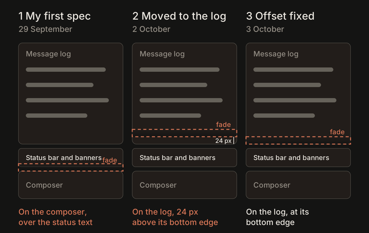
My second production walk on October 3, 2026, reported criteria 1, 2, 5 and 7 passing. The fade ended at the log’s bottom edge, the newest line read at full brightness, and a taller composer kept the edges together. I checked readable working status and a background-work banner, too. Criteria 3, 4, 6 and 8 had passed round one and were not repeated.
What I check now
My check now includes what sits between surfaces, what appears while an agent works, and where the band actually lands at different widths and composer heights. Before attaching another effect, my rule is to inspect those active states and keep the decoration on its own surface.
Sources
- PATCH-2999, 29 September 2026
- Commit d8299645a, 2 October 2026 — initial fade placement
- Commit 0ad07a44e, 2 October 2026 — move fade to the scrolling log
- Merge e74ead9dd, 2 October 2026 — corrected PR merged
- PATCH-2999 comment 17832, 3 October 2026 — first production walk
- Commit 44a0a245e, 3 October 2026 — correct the fade’s bottom offset
- PATCH-2999 comment 17848, 3 October 2026 — second production walk